The tools are the same. The context isn’t.
Everyone has the same models. What separates one output from another is what the model was given to decide with — and building that is design work, not prompting.
01 / The library
What the context actually is
Four working references, built over the second half of 2026, each one a distillation of books I own and read — not summaries scraped from the internet, and not a personality prompt.
They disagree with each other, and that is the point. A generic model averages what it read online into an answer that offends nobody. A library holds the disagreement, names who said what, and forces the resolution to state its condition. Two of those disagreements are below.
- 38
- books distilled, one at a time
- 53
- reference sheets
- ~344,000
- words
- 4
- skills — design, copy, photography, illustration
The illustration layer is organised by subject rather than one sheet per book, so its sheets are counted in the 53 but not in the 38. I would rather give you the awkward number than the round one.
02 / The switch
One brief, two states
A Portuguese home-services brand. Same service, same person, thirty-nine days apart — 10 July and 18 August 2026, with the library built in between. The switch changes the picture and the reasoning beside it.

What the check says
FAIL  headline: worst tile        1.19   (want >= 3.0)
FAIL  price line: worst tile      1.20   (want >= 3.0)
FAIL  action must outweigh the sticker
      measured, sticker / action  10.8×  (want <= 1.0)
Three failures, and none of them is an opinion.
what each failure is White copy laid over the brightest part of the photograph, a discount sticker outweighing the button by ten times, and a promise that fits every competitor word for word.
White copy over the brightest part of the photograph. The headline averages 11.7:1 of contrast and has tiles at 1.19. The price line falls to 1.20 and disappears into the curtain. At a 300px thumbnail the price no longer exists. An average hides this; a tile-by-tile measurement does not.
The most contrasted object is not the button. The discount sticker is a white plate on a dark photograph — maximum contrast — and it sits lower than the call to action, so it takes the last fixation. Measured as optical weight (painted area × contrast against its ground), the sticker weighs 10.8× the button.
The promise belongs to the category. “House cleaning by professionals” is true for every competitor, word for word.
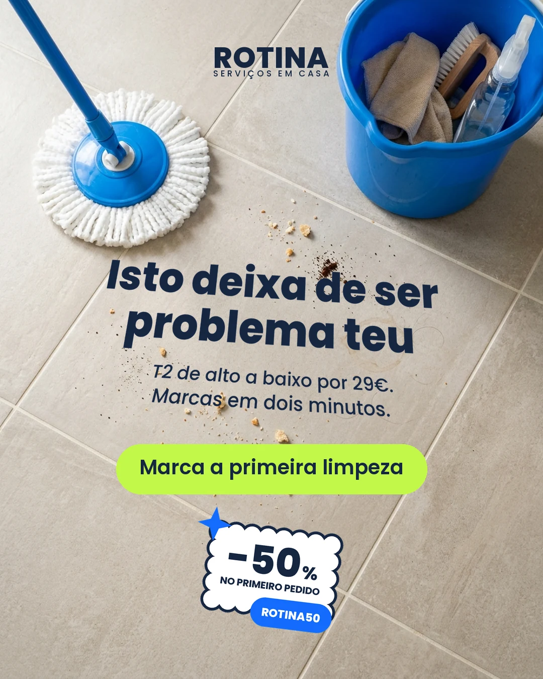
What the check says
PASS  headline: worst tile        7.41   (want >= 3.0)
PASS  subhead: worst tile         6.68   (want >= 3.0)
FAIL  button as an object         1.51   (want >= 3.0)  <- deliberate
note  navy would have given       8.04
Two passes, and one failure kept on purpose. The checklist did not veto the decision. It put the price of it on the table. A clean card would prove less than this one does.
the four decisions behind it Type laid into the floor plane so a word can point at real crumbs, an action colour taken from the ground instead of the brand, a measurement that told me not to do something, and the failure I kept at 1.51 where navy would have given 8.04.
Type laid into the floor plane. A keystone — bottom edge at full width, top edge drawn in 8% — plus a slight rotation, so the word “Isto” (“this”) sits against real photographed crumbs and points at them. Without the plane the word points at nothing.
The action colour belongs to the ground, not the brand. On this warm floor the brand blue falls to 2.43 as an object, white to 1.89, lime to 1.51. Only navy passes, at 8.04. And the brand blue stays out of the graphic layer entirely, because it is already in the photograph at scale — it is the bucket and the mop. Repeating it would put it in competition with itself.
A measurement that told me not to do something. Before fixing the angle I measured the tile grout, meaning to align the type to it. Two families of joint, at +25° and −19° — 44° apart, not 90°. It is a grid in perspective, so the apparent angle changes with where you stand in the frame. There is no correct angle to align to, and aligning to the measured 24° would have destroyed legibility in the name of false rigour.
And one check fails on purpose. The button is a lime pill with no edge: 1.51 as an object, against a 3.0 minimum. A navy fill would have given 8.04. The lime was kept as a composition decision, and the QA card records it as a failure, not as a silenced exception.
03 / The illustrated case
When photography is the wrong answer
This one has no before — nothing illustrated predates the library, and inventing one would be staging. It earns its place differently: it is the case where a photograph cannot do the job.
The claim is scope: not one clean, the whole house. Four rooms at once, one person working and another resting two rooms away, is a shot that does not exist photographically.
“forcing all the areas toward the six spectrum colors sets up competition which in the end is vying for attention and results in less brilliancy for any one area.”
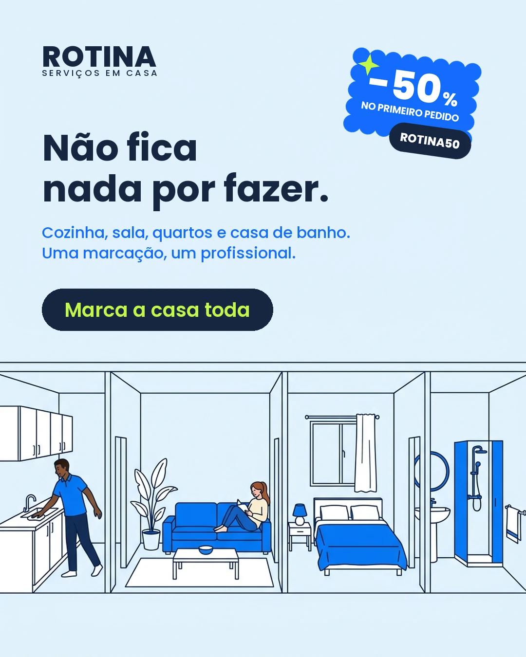
three things it produced that I now reuse A clear band measured before the layout is written — 762px of it here. Figure legibility turned into a number: 60.3px against a 55px threshold, where the reference piece gives 41px. And zero pixels of the action colour inside the drawing.
The reserved band is measured before the layout is written
A function walks the image top-down and returns the first row whose standard deviation exceeds 2. Here: 762px of clear field, and the type block ends at 679. If it had not fitted, the fix is a corrective clause in the prompt — never gymnastics in the compositor.
Figure legibility is a number
The brief said “human figures legible at a 300px thumbnail”. That became a measurement: the client’s reference piece gives 41px at thumbnail size; the threshold here is 55px, and the chosen frame gives 60.3px. The extra third is not rounding. At 41px the pose still reads and the gesture does not — and it is the gesture that makes a figure alive. Stanchfield puts it exactly: “anatomy is not the answer — acting is.”
The action colour never enters the drawing
The reference piece spreads the brand colour across five illustrated objects — kettle, apron, cushion, bedspread, towel — and none of them is the button. Here it is an assertion the build checks: zero pixels of the action colour inside the illustration. It exists once in the entire piece, on the button label. Inside the drawing the dominant blue does the work, four times, all subordinate.
04 / Two proofs
Where the library earned its keep
Not pieces — the two moments the library did work a prompt does not: it caught an inherited rule that was not a rule, and it held a disagreement instead of averaging it.
Proof 1 — “Blue with green should never be seen”
A rule that arrives with no mechanism behind it. The pair that should never be seen turns out to be the pair of trust, and the rule a class boundary that came back after 1789 as taste.
Which is not the same as ignoring contrast. The same author warns against blue and green in signage read at distance, and that one has a mechanism. Measured, this brand’s own lime on a light field gives 1.11 — the worst pair in its palette, found by the QA without being asked.
| pair | chords |
|---|---|
| yellow + orange | 37 |
| blue + white | 35 |
| blue + green | 32 |
Third most frequent pair in a survey of two thousand people — and it heads trust, harmony, sympathy, loyalty, tolerance.
the history, the count, and the method that travels Where the rule came from and which social group benefited from it, the perceptual reason the real restriction survives, and the three questions I now ask of any taste rule that arrives without one.
The rule arrives without a mechanism
Eva Heller traces it: in the 14th and 15th centuries the pair was luxury. Then green meant the middle class and blue meant the people who worked. When industrial dyeing made colour cheap and labourers started wearing blue, the combination came to stand for the two classes mixing — and after 1789 the bourgeoisie replaced sumptuary law with norms of “good taste”. The class prohibition came back as an aesthetic rule.
The counter-test, which is what makes it a proof
Two colours at the same luminance give hue contrast without value contrast; the edge is not resolved by the achromatic channel, the text vibrates, and for a deuteranope it vanishes. That is why the signage advice stands while the taste rule does not.
The method, which is the part that travels
When someone invokes a taste rule with no perceptual mechanism, look for three things: the period the rule appears in, which social group benefited from it, and whether it survived the material becoming cheap. A taste rule without a mechanism is usually a fossilised social boundary. And if there is a mechanism, the rule stays — and then you measure instead of arguing.
Proof 2 — The baseline grid, and a correction to my own summary
Five authors, filed as three books against two — until I went back to pin the citations and found one of the five on the other side. So it is not two camps. It is five people answering three different questions: is it possible? · is it beneficial? · is it possible some other way?
Ask a generic model and you get the internet’s average, use multiples of 8: not wrong, not right, and indifferent to the medium — the only thing that decides here.
Baseline grid where there is a page. Print, dense multicolumn, PDF, slide.
Vertical rhythm where there is a scroll. Every spacing an integer multiple or divisor of the body leading, with nothing forced to sit on a line.
the five authors, and where I was wrong Müller-Brockmann and Bringhurst resting the module on the baseline, Rutter’s reason it cannot hold on a screen, Lupton’s arithmetic — and Tim Brown, whom I had filed on the wrong side.
Two canonical books rest the module on the baseline
Müller-Brockmann is imperative about it: “the first line of the text in the grid field must fit flush against the top limit of the field whereas the last line must stand on the bottom limit.” Bringhurst: “leading must not change arbitrarily in type.”
Rutter gives the technical reason
In a browser, text is centred inside a line box; “the way web pages are laid out by browsers is like upside-down Tetris”, and forcing type to a baseline grid is “to pretend the web is something it isn’t: that is, print.” He also gives the reason the rule existed: baseline grids solve translucent paper, where light reveals the shadow of the type on the other side of the page. A screen has no other side.
Lupton gives the arithmetic, and the detail that closes it
As an alternative to a strict baseline grid, align the first line of two columns and let the rest fall. “This approach was used to design this book.” A printed book, beautifully set, does not use one.
And here the library was wrong about itself
I had this filed as “three books against two.” Going back to the source to pin the citations, Tim Brown turns out to be in favour of baseline grids — he wants ones that flex: “if baseline grids could be specified in CSS in a straightforward way, that would be a very big deal.”
05 / The honest pair
And this is what changes when the piece was already decent


This pair goes last because it is the honest one, and because it is what most real work looks like: both pieces pass every check and there is no failing card to point at. So I measured the gap instead of asserting it — and two of the three measurements came out against me.
| before | after | winner | |
|---|---|---|---|
| Local contrast of the copy | 8.50–12.61 | 4.14–4.19 | before |
| Contrast range across the area | 4.11 | 0.05 | after |
| Head/subhead separation, blurred to 2% | 1.35:1 | 1.18:1 | before |
| Elements carrying the action colour | 2 | 1 | after |
| The image states the offer with no copy | no | yes | after |
what the table means, line by line Why the earlier piece really is more legible and my hypothesis was wrong on both counts, why the later one states the offer with the copy covered, the two buttons competing in the first, and the copy — unmeasured here.
The earlier piece is more legible
Navy on a near-white wall gives 10.8:1 against the 4.2:1 of a saturated field, and it separates better at a distance, because a dark block on white produces a step in value that white on blue does not. My hypothesis was the opposite on both counts and it was wrong. That stays in the record.
The image carries the offer
Cover the copy on both. The first shows a man handing over a bag; the second shows a dirty basket, one continuous cloth, and pressed laundry — the whole proposition, before you read a word.
The earlier piece has two buttons
The pill and the sticker plate are the same colour, and the sticker is bigger and lower, so it takes the last fixation. One action colour, one action.
And the copy, which does not get measured here
The earlier version describes the category from the company’s side and could belong to any competitor, word for word. The later one describes the reader’s day. The earlier call to action points at a place; the later one points at what happens.
06 / The fine print
What this page does not claim
each of these, at length No performance data — nothing here says a piece converted better, reached further or cost less. ROTINA is a fictional brand, not a client. Both sides are reconstructions, and the before is rebuilt structurally faithful — never made worse so the comparison looks better. The pieces are in Portuguese, because the work was. Every craft claim carries a source — author, work, chapter, page.
No performance data
I hold none for these campaigns, so nothing here says a piece converted better, reached further, or cost less. If that is the evidence you need, this is not it.
ROTINA is a fictional brand
Built for this exercise. It is not a client, does not represent one, and no work is claimed that was not done. The original campaigns were made for a Portuguese home-services company and cannot be shown.
Both sides are reconstructions
Made from the briefs, not screenshots. The before is rebuilt structurally faithful — same positions, same relative sizes, same decisions, same mistakes. It is never made worse so the comparison looks better. The dates are real: the earlier pieces were made to run before the library existed.
The pieces are in Portuguese
Because the work was, and translating them would take the truth out of them.
Every craft claim has a source
Author, work, chapter, page — checked against the book rather than against my notes. Doing that changed three things I had written down wrong, and those corrections are in the record too.
If you want the argument, not the picture
The pieces are the illustration. The argument is the reasoning card beside each one, and that is the part that transfers to your brief and your constraints.